I live (and work!) near one of the most beautiful vantage points for sunsets in possibly the entire US.
However almost every beautiful sunset I have seen from there has come from either 1) me walking out of work and noticing that the sky is bright pink, or 2) seeing someone post a sunset photo on Twitter (I know). Either way it ends with me practically sprinting to the Brooklyn Heights Promenade for the tail end of the sunset.
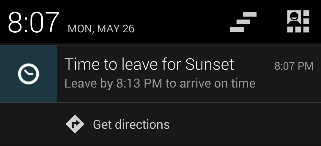
So, I decided to create some Google Calendar “appointments” for myself, using R and specifically the sunrise.set() function (thanks Carlos!). Because I’m a big user of Google Now, this means that–based on my location and travel time–my phone will buzz at me and tell me to leave for the Promenade in time to see the sunset.
Assuming you don’t live near me, you might want to customize your calendar to include the address of your own favorite vantage point for sunsets. So, I used this opportunity to create my personal R package and put this in as the first function. You can input your own address, timezone, etc. into the create_sunset_cal() function, and it will output a .CSV that meets Google’s requirements for importing a calendar. To get the function, just run the following:
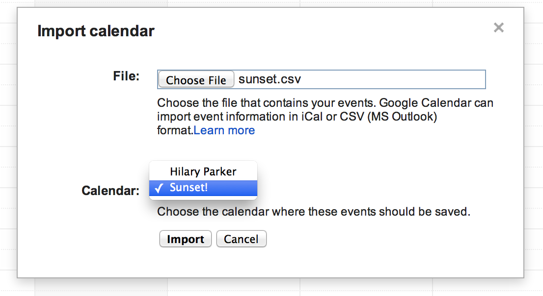
You can upload the .CSV directly into your Google calendar (just be careful as it will import a different event for every day, so if you do it mistakenly it will be a pain to remove!). I’ll give instructions for creating a new calendar just for the sunsets, so you can remove it whenever you want if your calendar looks too cluttered.
Create a new calendar, called “Sunset”. If you want to share the calendar, make it Public.
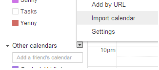
Under the “Other calendars” heading, click on “Import calendar”.
Select the .CSV you created using the create_sunset_cal() function, making sure you select your newly-created “Sunset” calendar.
Henceforth be notified about the travel time to the sunset!
As I have worked on various projects at Etsy, I have accumulated a suite of functions that help me quickly produce tables and charts that I find useful. Because of the nature of iterative development, it often happens that I reuse the functions many times, mostly through the shameful method of copying the functions into the project directory. I have been a fan of the idea of personal R packages for a while, but it always seemed like A Project That I Should Do Someday and someday never came. Until…
Etsy has an amazing week called “hack week” where we all get the opportunity to work on fun projects instead of our regular jobs. I sat down yesterday as part of Etsy’s hack week and decided “I am finally going to make that package I keep saying I am going to make.” It took me such little time that I was hit with that familiar feeling of the joy of optimization combined with the regret of past inefficiencies (joygret?). I wish I could go back in time and create the package the first moment I thought about it, and then use all the saved time to watch cat videos because that really would have been more productive.
This tutorial is not about making a beautiful, perfect R package. This tutorial is about creating a bare-minimum R package so that you don’t have to keep thinking to yourself, “I really should just make an R package with these functions so I don’t have to keep copy/pasting them like a goddamn luddite.” Seriously, it doesn’t have to be about sharing your code (although that is an added benefit!). It is about saving yourself time. (n.b. this is my attitude about all reproducibility.)
(For more details, I recommend this chapter in Hadley Wickham’s Advanced R Programming book.)
Step 0: Packages you will need
The packages you will need to create a package are devtools and roxygen2. I am having you download the development version of the roxygen2 package.
Step 1: Create your package directory
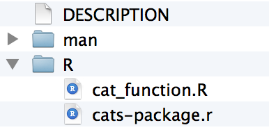
You are going to create a directory with the bare minimum folders of R packages. I am going to make a cat-themed package as an illustration.
setwd("parent_directory")
create("cats")
If you look in your parent directory, you will now have a folder called cats, and in it you will have two folders and one file called DESCRIPTION.
You should edit the DESCRIPTION file to include all of your contact information, etc.
Step 2: Add functions
If you’re reading this, you probably have functions that you’ve been meaning to create a package for. Copy those into your R folder. If you don’t, may I suggest something along the lines of:
cat_function <- function(love=TRUE){
    if(love==TRUE){
        print("I love cats!")
    }
    else {
        print("I am not a cool person.")
    }
}
Save this as a cat_function.R to your R directory.
(cats-package.r is auto-generated when you create the package.)
Step 3: Add documentation
This always seemed like the most intimidating step to me. I’m here to tell you — it’s super quick. The package roxygen2 that makes everything amazing and simple. The way it works is that you add special comments to the beginning of each function, that will later be compiled into the correct format for package documentation. The details can be found in the roxygen2 documentation — I will just provide an example for our cat function.
The comments you need to add at the beginning of the cat function are, for example, as follows:
#' A Cat Function
#'
#' This function allows you to express your love of cats.
#' @param love Do you love cats? Defaults to TRUE.
#' @keywords cats
#' @export
#' @examples
#' cat_function()

cat_function <- function(love=TRUE){
    if(love==TRUE){
        print("I love cats!")
    }
    else {
        print("I am not a cool person.")
    }
}
I’m personally a fan of creating a new file for each function, but if you’d rather you can simply create new functions sequentially in one file — just make sure to add the documentation comments before each function.
Step 4: Process your documentation
Now you need to create the documentation from your annotations earlier. You’ve already done the “hard” work in Step 3. Step 4 is as easy doing this:
setwd("./cats")
document()
This automatically adds in the .Rd files to the man directory, and adds a NAMESPACE file to the main directory. You can read up more about these, but in terms of steps you need to take, you really don’t have to do anything further.
(Yes I know my icons are inconsistent. Yes I tried to fix that.)
Step 5: Install!
Now it is as simple as installing the package! You need to run this from the parent working directory that contains the cats folder.
setwd("..")
install("cats")
Now you have a real, live, functioning R package. For example, try typing ?cat_function. You should see the standard help page pop up!
(Bonus) Step 6: Make the package a GitHub repo
This isn’t a post about learning to use git and GitHub — for that I recommend Karl Broman’s Git/GitHub Guide. The benefit, however, to putting your package onto GitHub is that you can use the devtools install_github() function to install your new package directly from the GitHub page.
install_github('cats','github_username')
Step 7-infinity: Iterate
This is where the benefit of having the package pulled together really helps. You can flesh out the documentation as you use and share the package. You can add new functions the moment you write them, rather than waiting to see if you’ll reuse them. You can divide up the functions into new packages. The possibilities are endless!
Additional pontifications: If I have learned anything from my (amazing and eye-opening) first year at Etsy, it’s that the best products are built in small steps, not by waiting for a perfect final product to be created. This concept is called the minimum viable product — it’s best to get a project started and improve it through iteration. R packages can seem like a big, intimidating feat, and they really shouldn’t be. The minimum viable R package is a package with just one function!
I came across this R package on GitHub, and it made me so excited that I decided to write a post about it. It’s a compilation by Karl Broman of various R functions that he’s found helpful to write throughout the years.
Wouldn’t it be great if incoming graduate students in Biostatistics/Statistics were taught to create a personal repository of functions like this? Not only is it a great way to learn how to write an R package, but it also encourages good coding techniques for newer students (since it encourages them to write separate functions with documentation). It also allows for easy reprodicibility and collaboration both within the school and with the broader community. Case in point — I wanted to use one of Karl’s functions (which I found via his blog… which I found via Twitter), and all I had to do was run:
(Note that install_github is a function in the devtools package. I would link to the GitHub page for that package but somehow that seems circular…)
For whatever reason, when I think of R packages, I think of big, unified projects with a specified scientific aim. This was a great reminder that R packages exist solely for making it easier to distribute code for any purpose. Distributing tips and tricks is certainly a worthy purpose!
Last night on twitter there was a bit of a firestorm over this New York Times snippet about p-values (here is my favorite twitter-snark response). While the article has a surprising number of controversial sentences for only 180 words, the most offending sentence is:
By convention, a p-value higher than 0.05 usually indicates that the results of the study, however good or bad, were probably due only to chance.
One problem with this sentence is that it commits a statistical cardinal sin by stating the equivalent of “the null hypothesis is probably true.” The correct interpretation for a p-value greater than 0.05 is “we cannot reject the null hypothesis” which can mean many things (for example, we did not collect enough data).
Another problem I have with the sentence is that the phrase “however good or bad” is incredibly misleading — it’s like saying that even if you see a fantastically big result with low variance, you still might call it “due to chance.” The idea of a p-value is that it’s a way of defining good or bad. Even if there’s a “big” increase or decrease in an outcome, is it really meaningful if there’s bigger variance in that change? (No.)
I’d hate to be accused of being an armchair critic, so here is my attempt to convey the meaning/importance of p-values to a non-stat, non-math audience. I think the key to having a good discussion of this is to provide more philosophical background (and I think that’s why these discussion are always so difficult). Yes this is over three times the word count of the original NYTimes article, but fortunately the internet has no word limits.
(n.b. I don’t actually hate to be accused of being an armchair critic. Being an armchair critic is the best part of tweeting, by far.)
(Also fair warning — I am totally not opening the “should we even be using the p-value” can of worms.)
Putting a Value to ‘Real’ in Medical Research
by Hilary Parker
In the US judicial system, a person on trial is “innocent until proven guilty.” Similarly, in a clinical trial for a new drug, the drug must be assumed ineffective until “proven” effective. And just like in the courts, the definition of “proven” is fuzzy. Jurors must believe “beyond a reasonable doubt” that someone is guilty to convict. In medicine, the p-value is one attempt at summarizing whether or not a drug has been shown to be effective “beyond a reasonable doubt.” Medicine is set up like the court system for good reason — we want to avoid claiming that ineffective drugs are effective, just like we want to avoid locking up innocent people.
To understand whether or not a drug has been shown to be effective “beyond a reasonable doubt” we must understand the purpose of a clinical trial. A clinical trial provides an understanding of the possible improvements that a drug can cause in two ways: (1) it shows the average improvement that the drug gives, and (2) it accounts for the variance in that average improvement (which is determined by the number of patients in the trial as well as the true variation in the improvements that the drug causes).
Why are both (1) and (2) necessary? Think about it this way — if I were to tell you that the price between two books was $10, would you think that’s a big price difference, or a small one? If it were the difference in price between two paperback books, it’d be a pretty big difference since paperback books are usually under $20. However if it were the difference in price between two hardcover books, it’d be a smaller difference in prices, since hardcover books vary more in price, in part because they are more expensive. And if it were the difference in price between two ebook versions of printed books, that’d be a huge difference, since ebook prices (for printed books) are quite stable at the $9.99 mark.
We intuitively understand what a big difference is for different types of books because we’ve contextualized them — we’ve been looking at book prices for years, and understand the variation in the prices. With the effectiveness of a new drug in a clinical trial, however, we don’t have that context. Instead of looking at the price of a single book, we’re looking at the average improvement that a drug causes — but either way, the number is meaningless without knowing the variance. Therefore, we have to determine (1) the average improvement, and (2) the variance of the average improvement, and use both of these quantities to determine whether the drug causes a “good” enough average improvement in the trial to call the drug effective. The p-value is simply a way of summarizing this conclusion quickly.
So, to put things back in terms of the p-value: let’s say that someone reports that NewDrug is shown to increase healthiness points by 10 points on average, with a p-value of 0.01. The p-value provides some context for whether or not an average increase of 10 points in this trial is “good” enough for the drug to be called effective, and is calculated by looking at both the average improvement, and the variance in improvements for different patients in the trial (while also controlling for the number of people in the trial). The correct way to interpret a p-value of 0.01 is: “If in reality NewDrug is NOT effective, then the probability of seeing an average increase in healthiness points at least this big if we repeated this trial is 1% (0.01*100).” The convention is that that’s a low enough probability to say that NewDrug has been shown to be effective “beyond a reasonable doubt” since it is less than 5%. (Many, many statisticians loathe this cut-off, but it is the standard for now.)
A key thing to understand about the p-value in a clinical trial is that a p-value greater than 0.05 doesn’t “prove” that NewDrug is ineffective — it just means that NewDrug wasn’t shown to be effective in the clinical trial. We can all think of examples of court cases where the person was probably guilty, but was not convicted (OJ Simpson, anyone?). Similarly with the p-value, if a trial reports a p-value greater than 0.05, it doesn’t “prove” that the drug is ineffective. It just means that researchers failed to show that the drug was effective “beyond a reasonable doubt” in the trial. Perhaps the drug really is ineffective, or perhaps the researchers simply did not gather enough samples to make a convincing case.
edit: In case you’re doubting my credentials regarding p-values, I’ll just leave this right here…
I’ve always had a special fondness for my name, which — according to Ryan Gosling in “Lars and the Real Girl” — is a scientific fact for most people (Ryan Gosling constitutes scientific proof in my book). Plus, the root word for Hilary is the Latin word “hilarius” meaning cheerful and merry, which is the same root word for “hilarious” and “exhilarating.” It’s a great name.
Several years ago I came across this blog post, which provides a cursory analysis for why “Hillary” is the most poisoned name of all time. The author is careful not to comment on the details of why “Hillary” may have been poisoned right around 1992, but I’ll go ahead and make the bold causal conclusion that it’s because that was the year that Bill Clinton was elected, and thus the year Hillary Clinton entered the public sphere and was generally reviled for not wanting to bake cookies or something like that. Note that this all happened when I was 7 years old, so I spent the formative years of 7-15 being called “Hillary Clinton” whenever I introduced myself. Luckily, I was a feisty feminist from a young age and rejoiced in the comparison (and life is not about being popular).
In the original post the author bemoans the lack of research assistants to perform his data extraction for a more complete analysis. Fortunately, in this era we have replaced human jobs with computers, and the data can be easily extracted using programming. This weekend I took the opportunity to learn how to scrape the social security data myself and do a more complete analysis of all of the names on record.
Is Hilary/Hillary really the most rapidly poisoned name in recorded American history? An analysis.
I will follow up this post with more details on how to perform web-scraping with R (for this I am infinitely indebted to my friend Mark — check out his storyboard project and be amazed!). For now, suffice it to say that I was able to collect from the social security website the data for every year between 1880 and 2011 for the 1000 most popular baby names. For each of the 1000 names in a given year, I collected the raw number of babies given that name, as well as the percentage of babies given that name, and the rank of that name. For girls, this resulted in 4110 total names.
In the original analysis, the author looked at the changed rank of “Hillary.” The ranks are interesting, but we have more finely-tuned data than that available from the SSA. The raw numbers of babies named a certain name are likewise interesting, but do not normalize for the population. Thus the percentages of babies named a certain name is the best measurement.
Looking at the absolute chance in percentages is interesting, but would not tell the full story. A change of, say 15% to 14% would be quite different and less drastic than a change from 2% to 1%, but the absolute change in percentage would measure those two things equally. Thus, I need a measure of the relative change in the percentages — that is, the percent change in percentages (confusing, I know). Fortunately the public health field has dealt with this problem for a long time, and has a measurement called the relative risk, where “risk” refers to the proportion of babies given a certain name. For example, let’s say the percentage of babies named “Jane” is 1% of the population in 1990, and 1.2% of the population in 1991. The relative risk of being named “Jane” in 1991 versus 1990 is 1.2 (that is, it’s (1.2/1)=1.2 times as probable, or (1.2-1)*100=20% more likely). In this case, however, I’m interested in instances where the percentage of children with a certain name decreases. The way to make the most sensible statistics in this case is to calculate the relative risk again, but in this case think of it as a decrease. That is, if “Jane” was at 1.5% in 1990 and 1.3% in 1991, then the relative risk of being named “Jane” in 1991 compared to 1990 is (1.3/1.5)=0.87. That is, it is (1-0.87)*100=13% less likely that a baby will be named “Jane” in 1991 compared to 1990.
(Note that I’m not doing any model fitting here because I’m not interested in any parameter estimates — I have my entire population! I’m just summarizing the data in a way that makes sense.)
So, for each of the 4110 names that I collected, I calculated the relative risk going from one year to the next, all the way from 1880 to 2011. I then pulled out the names with the biggest percent drops from one year to the next.
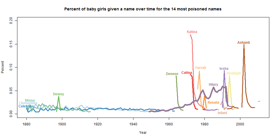
#6?? I’m sorry, but if I’m going to have one of the most rapidly poisoned names in US history, it best be #1. I didn’t come here to make friends, I came here to win. Furthermore, the names on this list seemed… peculiar to say the least. I decided to plot out the percentage of babies named each of the names to get a better idea of what was going on. (Click through to see the full-sized plot. Note that the y-axis is Percent, so 0.20 means 0.20%.)
These plots looked quite curious to me. While the names had very steep drop-offs, they also had very steep drop-ins as well.
This is where this project got deliriously fun. For each of the names that “dropped in” I did a little research on the name and the year. “Dewey” popped up in 1898 because of the Spanish-American War — people named their daughters after George Dewey. “Deneen” was one name of a duo with a one-hit wonder in 1968. “Katina” and “Catina” were wildly popular because in 1972 in the soap opera Where the Heart Is a character is born named Katina. “Farrah” became popular in 1976 when Charlie’s Angels, starring Farrah Fawcett, debuted (notice that the name becomes popular in 2009 when Farrah Fawcett died). “Renata” was hard to pin down — perhaps it was popular because of this opera singer who seemed to be on TV a lot in the late 1970s. “Infant” became a popular baby name in the late 1980s for reasons that completely defy my comprehension, and that are utterly un-Google-able. (Edit: someone pointed out on facebook that it’s possible this is due to a change in coding conventions for unnamed babies. This would make more sense, but would also make me sad. Edit 2: See the comments for an explanation!)
I think we all know why “Iesha” became popular in 1989:
“Khadijah” was a character played by Queen Latifa in Living Single, and “Ashanti” was popular because of Ashanti, of course.
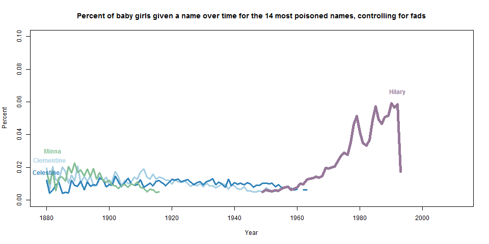
“Hilary”, though, was clearly different than these flash-in-the-pan names. The name was growing in popularity (albeit not monotonically) for years. So to remove all of the fad names from the list, I chose only the names that were in the top 1000 for over 20 years, and updated the graph (note that I changed the range on the y-axis).
I think it’s pretty safe to say that, among the names that were once stable and then had a sudden drop, “Hilary” is clearly the most poisoned. I am not paying too much attention to the names that had sharp drops in the late 1800s because the population was so much smaller then, and thus it was easier to drop percentage points without a large drop in raw numbers. I also did a parallel analysis for boys, and aside from fluctuations in the late 1890s/early 1900s, the only name that comes close to this rate of poisoning is Nakia, which became popular because of a short-lived TV show in the 1970s.
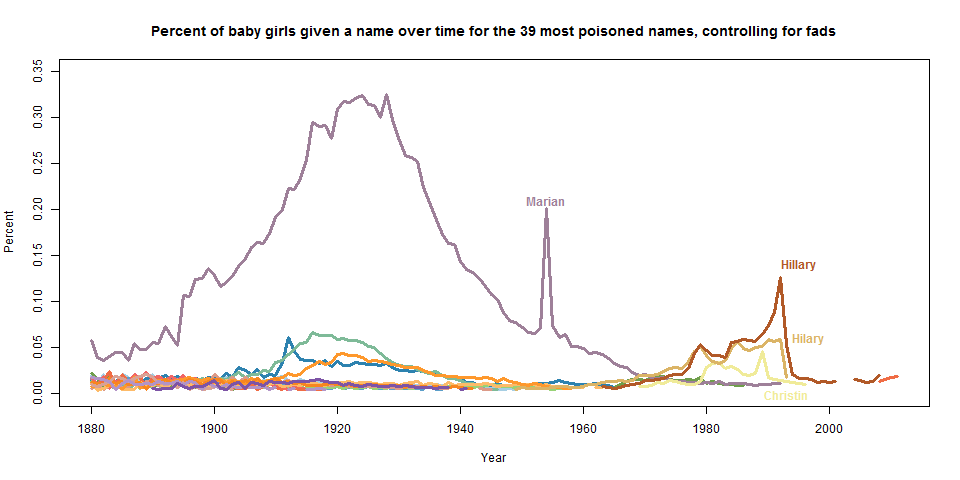
At this point you’re probably wondering where “Hillary” is. As it turns out, “Hillary” took two years to descend from the top, thus diluting out the relative risk for any one year (it’s highest single-year drop was 61% in 1994). If I examine slightly more names (now the top 39 most poisoned) and again filter for fad names, both “Hilary” and “Hillary” are on the plot, and clearly the most poisoned.
(The crazy line is for “Marian” and the spike is due to the fact that 1954 was a Catholic Marian year — if it weren’t an already popular name, it would have been filtered as a fad. And the “Christin” spike might very well be due to a computer glitch that truncated the name “Christina”! Amazing!!)
So, I can confidently say that, defining “poisoning” as the relative loss of popularity in a single year and controlling for fad names, “Hilary” is absolutely the most poisoned woman’s name in recorded history in the US.
(Personal aside: I will get sentimental for a moment, and mention that my mother was a at Wellesley the same time as Hillary Rodham. While she already knew that she wanted to name her future daughter “Hilary” at that point, when she saw Hillary speak at a student event, she thought, “THAT is what I want my daughter to be like.” Which was empirically the polar opposite of what the nation felt in 1992. But my mom was right and way ahead of her time.)
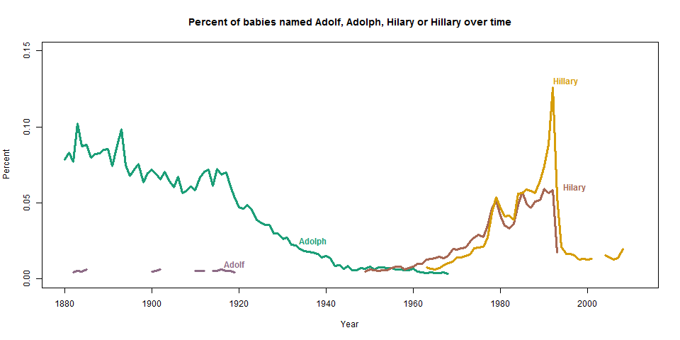
Update: This seems to be an analysis everyone is interested in. For perhaps the first time in internet history, Godwin’s Law is wholly appropriate.
Sometimes this is my life. But it’s so satisfying when you write a program that saves you time! Here is an example.
The Problem:
For several years at Hopkins I have been involved in teaching a large (500+ person) introductory Biostatistics class. This class usually has a team of 12-15 teaching assistants, who together staff the twice-daily office hours. TAs are generally assigned to “random” office-hours, with the intention that students in the class get a variety of view-points if, for example, they can only come to Tuesday afternoon office hours.
When I started the course, the random office-hours were assigned by our very dedicated administrative coordinator, who sent them out via email on a spreadsheet. Naturally, there were several individual TA conflicts, which would result in more emails, which would lead to version control problems and — ultimately — angry students at empty office hours. Additionally, assigning TAs to random time-slots for an 8-week class was a nightmare for the administrative assistant.
The Solution:
I really wanted us to start using Google Calendar, so that students could easily load the calendars into their own personal calendars, and that changes on the master calendar would automatically be pushed to students’ calendars. So, in order to achieve this goal, I wrote a function in R that would automatically generate a random calendar for the TAs, write these calendars to CSV documents that I could then upload to a master Google Calendar. It has worked wonderfully!
My general philosophy with this project was that it is much easier to create a draft and then modify it, than it is to create something from scratch that fits every single parameter. So, I controlled for as many factors as I reasonably could (holidays, weekends, days when we need double the TAs, etc.). Then, as TAs have conflicts or other problems arise, I can just go back and modify the calendar to fit individual needs. You’d be amazed — even with each TA having several constraints on his or her time, I generally only need to make a few modifications to the calendar before the final draft. Randomness works!
There are a few tricks that made this function work seamlessly. My code below depends on the chron package. To assign TAs, it’s best to think about the dates for your class as a sequence of slots that need to be filled, omitting weekend days, holidays and other days off, and accommodating for days when you might need twice as many TAs (for example right before exams when office hours are flooded).
Now that you have the sequence of dates, you need to randomly fill them. I accomplish this by dividing the sequence of dates into bins that are equal to the number of TAs, and then randomly sampling the TA names without replacement for each of the bins. This might leave a remainder of un-filled days at the end, so you have to make up for that as well.
This way, even though the TAs are randomly assigned, I avoid assigning one person to time-slots only during the last week of classes, for example.
The final step is writing these schedules out into a CSV format that can be uploaded to Google Calendar (here’s the format needed). I create a separate CSV for each of the TAs, so that each has his or her own calendar that can be imported into a personal calendar.
Here’s the workflow for creating the calendars. Of course, this is very specific to the class I helped teach, but the general workflow might be helpful if you’re facing a similar scheduling nightmare!
Using this function (github — use the example template which calls the gen_cal.R function), create a random calendar for each of the TAs. These calendars will be saved as CSV documents which can then be uploaded to Google Calendar. There are options for the starting day of class, ending day of class, days off from class, days when you want twice as many TAs (for example, right before an exam), and some extra info like the location of the office hours.
On Google Calendar, create a calendar for each of the TAs (I might name mine “Hilary Biostat 621” for example). Make the calendar public (this helps with sharing it to TAs and posting it online)
For each TA, import the CSV document created in step 1 by clicking “import calendar” under the “other calendars” tab in Google Calendar. For the options, select the CSV document for a specific TA, and for the “calendar” option, select the calendar you created in step 2 for that specific TA. (Life will be easiest if you only perform this step once, because if you try to import a calendar twice, you’ll get error messages that you’ve already imported these events before.)
Bonus step: Once all the calendars are imported, embed the calendars onto a website (keep secret from students in the class if you don’t want them to know when certain TAs are working!). This serves two purposes. First, it serves as the master calendar for all of the TAs and instructors. Second, by distributing it to TAs, they can add their calendar to their personal Google Calendar by clicking the plus icon on the bottom right corner. Your final beautiful product will look something like this! (Note that I also created a calendar that has important class dates like the quizzes and exams).
The Result:
Time spent developing and implementing: ~3 hours. Time spent each semester re-creating for new TAs: ~30 minutes. Time saved by myself, the administrative coordinator, and all of the TAs — and instead spent feeling awesome: infinity.
My derby wife Logistic Aggression (aka Hanna Wallach) posted a fantastic essay (via her blog) about things she’s learned from roller derby. Some points are pretty derby specific, and some are more broadly applicable. Points 4 and 5 – about “growth mindset” and “grit” – are especially worth a look for non-roller-girls, and apply directly to challenges in grad school. Kate Clancy, an Anthropology professor and roller girl in Illinois, has also written a series of awesome, insightful essays about the connection between derby and academics. I’ve always had a soft spot in my heart for discussions about the parallels between sports and real life. But there’s been something about doing such an intense organized sport outside of the traditional time to do so that has made it a much more enlightening experience.
Basically if you want to figure out who the really cool, insightful professors are, look for the roller girls! (No offense to the male professors of course – but there is male roller derby so no excuses!)